An insights tool that generated more support tickets than insights
The insights tool was a bit of a black box – marketers couldn't answer basic questions about their campaigns without calling support.
The problem
Everything everywhere, all at once
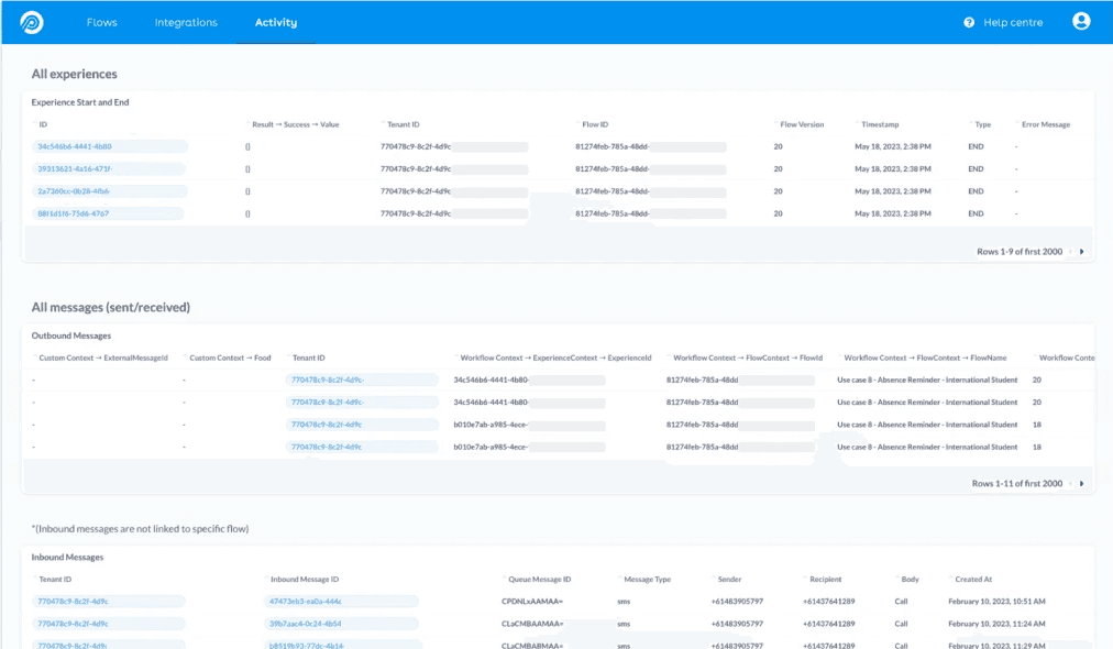
In Pendula, Flow Activity is where users troubleshoot their workflows: who succeeded, who failed, and why. The existing solution made it almost impossible to coherently piece together a customer journey. As the Senior Product Designer, I led this redesign from the ground up.
The results
Self-service troubleshooting became genuinely viable
100%
adoption. Users were given a 30-day parallel run before the legacy tool was retired — adoption preceded the deadline.
20%
reduction in support tickets related to flow troubleshooting.
10×
faster performance. User research surfaced timed-out queries as a top frustration. Previously timing out, queries now load in 10 seconds or less.

"With this new functionality, we can quickly see the total count of the response. This is very helpful in terms of tracking the campaign effectiveness."
– Chris Newton, Head of Professional Services from ReadyTech
Customers finally had the insights and reporting they'd been asking for — insights that were impossible to get from the old tool. Marketers can now answer their own questions, understand their campaigns, and iterate faster without waiting on support.
reflection
The initial assumption was that users needed to see everything, but limited time and resources forced a harder question: troubleshooting or stickiness? Root cause analysis settled it. The support ticket spike wasn't user error; the old interface's technical wording was making simple formatting errors impossible to read. The harder part was taking those findings to CS, Engineering, Sales, Product, and the C-Suite. What moved them wasn't the research data; it was a single scenario: a marketer gets a formatting error, can't read what it means, and calls support, not because they're confused, but because the design gave them nothing to go on. CS heard fewer tickets, Sales heard a self-service argument, Engineering heard less overhead, and Product heard users who could finally do their jobs. Working with the PM, we mapped features against UX impact. The message and experience views emerged as the priority, and usability testing with real customers confirmed the direction before engineering committed.
discover: research
Users want a story, not a data dump
I ran user interviews and contextual inquiry with the customer success team — observing how they navigated the tool on behalf of customers — to surface primary problems. Contextual inquiry surfaced workarounds that interviews hadn't caught.
Affinity mapping created from this surfaced three consistent themes:
Users want a story, not a list. Marketers needed to see how their campaign performed — not scroll through a raw event log and piece it together themselves.
Insights need to be glanceable. At high send volumes, the old tool could not handle the query size and timed out. Even when it loaded, granular detail buried the signal in noise.
Users want to be self-sufficient. Users wanted to troubleshoot their own flows — without waiting on the support team for every formatting error.
Root cause analysis revealed the problem wasn't user behaviour — it was the interface's technical wording making simple errors unreadable.

The previous state: an anonymised list of events with no narrative thread. Simple formatting errors were escalated straight to the support team because of its technical wording.
develop
Exploring UI concepts


define
Usability testing with real customers
I tasked participants with filtering to a specific customer's journey. Information surfaced progressively — only as relevant. The sessions confirmed the progressive disclosure model worked: users found what they needed without being overwhelmed by what they didn't.
High-fidelity prototype tests with customers shaped the MVP scope. From there, I worked with the engineering team from scoping through release — balancing the core problem against technical constraints and keeping potential debt visible.
deliver
A contextual, intuitive troubleshooting experience
At a glance: how many customers got the message, replied, and what they said.
The summary view marketers had been asking for – without opening a ticket to get it.
Every touchpoint in a single timeline. The first time a marketer could see exactly where — and why — a customer's journey stalled.
Results
The quantitative wins were clear — but on a qualitative level:
Marketers could finally answer their own campaign questions for the first time. Progressive disclosure cut cognitive load — users saw what mattered, when it mattered. Clearer error messages meant fewer calls to support leading to the 20% support ticket reduction.
The product shipped, the users adopted it, and the business outcome followed. Pendula was acquired in August 2025.
My role
skills
Product design
User research
Data visualisation
Tools
Claude
Figma
Storybook
Chromatic
Team
Lead product designer (me!)
4 engineers
1 engineering manager
1 product manager